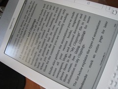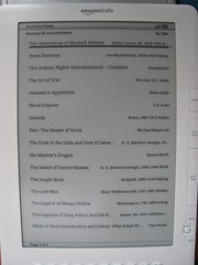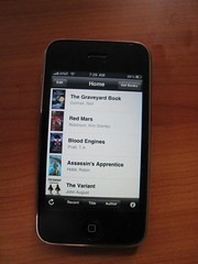
My first experience with the Kindle was through the iPhone App, which was a pretty positive experience; it is more or less, the Kindle experience on an iPhone. Lately, I've been using the Kindle app extensively for reading, and decided to purchase a Kindle DX; this is their "magazine-size" e-reader, and it measures about the size of a narrow magazine. The Kindle DX is remarkably light, and feels solid; the pixel density is 160 dpi, which matches that of the iPhone.
Because I've been using the iPhone for reading Kindle materials, the controls are a bit different on the DX; there are a series of buttons along the right side of the screen which serve as the buttons to turn the page, open the menu, home and go back, and a multi-directional joystick as well as a physical keyboard along the bottom; the keyboard buttons are incredibly tiny, and the large e-paper display is covered with a matte finish antiglare screen.
In some ways, the experience of reading on an iPhone is superior to reading on a Kindle; the limited shades of gray make color illustrations dithered, and my biggest problem in converting thus far is that I keep wanting to touch the screen to turn the page or highlight terms in the dictionary, instead of using the appropriate buttons. I think the Kindle holds tremendous promise, it has many useful features such as the built-in dictionary, and the very odd text-to-speech voice function. Notes and bookmarks are semiuseful, though I simply abhor using the keyboard; While I applaud their use of using an USB cable to charge the Kindle, the USB connector type is micro-USB, vs. the more standard mini-USB which more often used for cameras, cellphones and PS3 controllers.
The Kindle DX features rotation, which is practically never used due to the design of the ebook reader, the placement of the buttons makes it difficult to in any other orientation other than portrait. The adjustable font size is nice, though there are no selections of font style, and the configuration options of the Kindle are abysmal; one has the option of naming the device, and registering the device, adding personal info, and changing the list of e-mail addresses allowed to e-mail your Kindle. Menus are location-sensitive; the menu in the Home page is different from the menu on the book pages. The iPhone Kindle App has the same limited settings as the DX.
The one big difference that I appreciate in the iPhone Kindle App is that with page turning, it feels much more natural than the Kindle DX; the page simply slides, while on the Kindle DX, there is a brief flash as the e-paper wipes it contents from the page and places the next content; the text however is very clear; while not quite print-quality crispness, it does come very close to matching print when it is larger; the smaller font sizes still feel more crisp than computer font, but not by much.
While the Kindle platform does hold some promise; one wonders if an enlarged iPhone would in fact work just as well as a Kindle, if not better; while there isn't really much need in color for reading books, and yet the iPhone Kindle App handles it so well by having a selection of page background colors and adjusting the text color to match; the Kindle DX feels too much like a device from the 1980s without color, and doing color would allow for Amazon to be able to sell their downloadable media content for use on the device as well. While I think the Kindle does have some usefulness in reading books; particularly big, heavy tomes, it feels like a proof of concept product; the Kindle DX lacks security controls, privacy controls and content control, and there's no way to set the timer for screensaver mode (or even a way to blank it out to a specific screensaver as far as I can tell).
The Kindle DX includes a very basic web browser, one which is capable of handling text, but the Kindle DX is very clearly not designed for it; the lack of colons and backslashes on the physical keyboard make the entry of URLs really difficult, and the number keys require ALT key presses; the Kindle DX also includes an MP3 player, but I find the location of the headphone jack somewhat cumbersome (it's located on the top center of the device) and the control involve an arcane combination of keypresses to activate and play.
One thing I noticed as soon as I received the box was just how environmentally friendly the packaging was -- nearly every component of the packaging was paper or cardboard; the notable exception was the plastic cover to protect the screen, and the little sticker which held it down; no other piece of the packaging was plastic; not a single plastic bag was found within, no styrofoam or polystyrene.
The Kindle DX still feels like a work in progress, and it's for that reason that I say that it isn't for everyone; for frequent travelers or those who just want an e-reader that can download the latest book from the ether, it's great; no longer will I hurt my arms and shoulders carrying around an backpack loaded with books; but at the same time, when you look and use the Kindle DX and the iPhone Kindle Reader; you see what the experience could be in a few years; and compared to what is available now, the Kindle DX still feels like it has a long way to go.


Leave a comment